UNIT.City — місце, де люди працюють... КРАЩЕ! Обирай свій простір просто зараз 👉
Олександр КузьменкоThat's Life
10 June 2025, 10:05
2025-06-10
"Hard to read". Apple's new Liquid Glass design criticized by designers and users
At WWDC 2025, Apple announced a revamped user interface for its operating systems called Liquid Glass. It features shiny, mirrored, and transparent elements that give the software a more «glassy» look, but according to designers and social media users, it also makes the interface difficult to read and similar to Windows Vista.
At WWDC 2025, Apple announced a revamped user interface for its operating systems called Liquid Glass. It features shiny, mirrored, and transparent elements that give the software a more «glassy» look, but according to designers and social media users, it also makes the interface difficult to read and similar to Windows Vista.
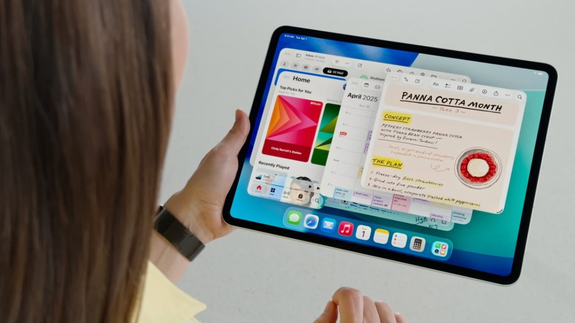
Apple’s updated translucent design for iOS 26 (another new feature from the company) Liquid Glass is now available to developers, with a public beta scheduled for next month. The update is the first major redesign of Apple’s interface in 10 years, inspired by the Vision Pro design. Liquid Glass will gradually spread to all of the company’s devices.
After the WWDC 2025 presentation, many designers and users are concerned about how the new design will affect the readability of the interface of Apple gadgets.
«Some of it is hard to read. Mainly because I think they made it too transparent,» Allan Yu, a product designer who currently works on the workplace messaging app Output, told WIRED. He suggests increasing the blur or adjusting backgrounds to make the design more readable on screen.
«Like the first beta of iOS 7, what we’ve seen so far is flawed and can be distracting or difficult to read, especially for users with visual impairments,» said Josh Puckett, co-founder of Iteration, a company that helps startups with design. Puckett hopes that readability will improve over time.
Sergey Popov, a design software engineer at MacPaw, which makes the CleanMyMac app, is curious to see how the new operating system will look on a Mac in bright lighting conditions, where glare already affects visibility. But overall, he liked Liquid Glass. «I think it makes everything look bigger, and it makes it easier to read and interact with the user interface,» Popov says. He thinks the new design and updates look especially impressive on the iPad.
Some designers believe that this new look can be overly distracting to users.
«From a technical perspective, it’s a very amazing effect. I applaud the time and effort that must have gone into simulating light refraction and scattering at such a high level. But unfortunately, I haven’t seen any examples where it’s implemented in a way that complements the larger context. If you’re designing an interface that distracts from the larger context, you’re doing it the wrong way,» says Adam Whitcroft, a designer at Owner.com, which builds apps and websites for restaurants.
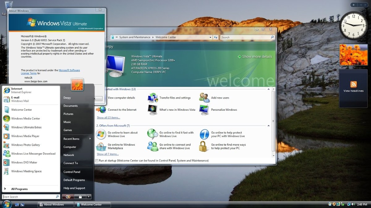
«I can’t wait until I can’t read anything on my iPhone,» The Verge senior editor Tom Warren ironically commented on Apple’s new design. The publication published an article comparing Liquid Glass to the Windows Aero design used in the Windows Vista operating system.
Windows Vista interface
«It’s impossible to look at Liquid Glass and not think of Windows Aero, the similar glassy, translucent design that was introduced in Windows Vista. (That’s a tough comparison.) With Aero, Microsoft went all out to make it easy for users to navigate their computer and find what they needed. You could see through windows to other windows; app borders changed to match the content; you could use widgets and live thumbnails to quickly access information,» wrote The Verge editor David Pearce.
He recalled that Aero didn’t last long, in part because it required a lot of resources to render such a graphically rich image.